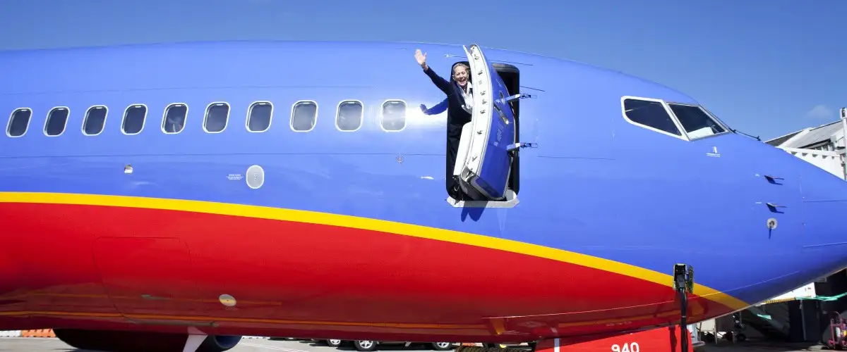
Southwest’s new logo and aircraft livery, unveiled today, are a bit more than a simple refresh, and a bit less than a ground-up redesign.
The logo is the biggest change, jettisoning the winged heart and company logotype in favor of a simple heart shape trisected diagonally by the airline’s new trifecta of corporate colors. Another version pairs the new heart with “Southwest.”
The first impression given by the new aircraft color scheme will be that it’s brighter, more vibrant. That’s largely due to the orangish element in the old blue-red-orange scheme being replaced by a more assertive yellow. “Southwest” is now prominently splashed across the side of the aircraft, in white, rather than just on the tail fin. And “Southwest.com” is printed across the engine housings, also in bold white.
It is, all in all, a confident but friendly look. The heart is featured more prominently (Southwest is based at Dallas Love Field, and its stock ticker is LUV), appropriately. Many Southwest customers won’t notice the change at all. Those who do will likely give it a thumbs-up.
There’s a photo gallery of the new Southwest corporate identity elements here.
Reader Reality Check
Southwest’s new color scheme: Yay or nay?
This article originally appeared on FrequentFlier.com.
We hand-pick everything we recommend and select items through testing and reviews. Some products are sent to us free of charge with no incentive to offer a favorable review. We offer our unbiased opinions and do not accept compensation to review products. All items are in stock and prices are accurate at the time of publication. If you buy something through our links, we may earn a commission.
Top Fares From


Today's Top Travel Deals
Brought to you by ShermansTravel
Ireland: 9-Night Dublin, Kilkenny, Killarney, Galway...
Brendan Vacations
 vacation
$3875+
vacation
$3875+
Amsterdam to Copenhagen: Luxe, 18-Night Northern...
Regent Seven Seas Cruises
cruise
$12399+
Ohio: Daily Car Rentals from Cincinnati
85OFF.com
 Car Rental
$19+
Car Rental
$19+