This morning, my inbox and social-media feed were chock full of messages from and about Virgin America. And they had nothing to do with the airline’s rumored merger with JetBlue or Alaska Airlines, a developing story that concerns the company’s very existence.
Rather, the breaking news concerned Virgin America’s new logo. In place of the “Virgin” script logo, the company claimed to be introducing “a new logo that captures the essence of our iconic brand.”
What it looks like is the bold white outline of two avocados, side by side, inside a bright-red circle. I puzzled over its intended meaning for some time before deciding it simply had to be taken on its own terms, as an abstract image with no meaning beyond itself.
RELATED: Surviving a Plane Crash: There’s an App for That
I may have been racking my brain in vain, however.
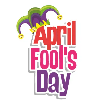
USA Today speculated that the logo reveal is just the latest Virgin America April Fools’ joke, a successor to last year’s tongue-in-cheek announcement that the airline planned to launch service to Branson (as in Richard Branson), Missouri.
If it is a joke, it’s an exceptionally elaborate one. The Twitter posts. The emails. The extensive post on Virgin America’s website detailing the design process, complete with illustrations and a YouTube video featuring Sir Richard himself.
But amid all the apparent seriousness, there’s this, embedded in the lengthy description of the design considerations underlying the logo’s two side-by-side circles:
To achieve the look and feel, a team of 15 designers spent over 2,500 hours perfecting the precise shape of the circles. In fact, if you look closely, you’ll see that each circle is designed to mimic the nose of our Airbus A320 aircraft. To achieve this effect, Connor had us physically remove the entire nose and flight deck of one of our aircraft. The 14 ton section was then lifted with a crane on to a giant sheet of paper the length of an entire football field, at which point Connor traced the shape with a charcoal pencil to achieve the thick, bold lines you see bordering the logo.
So yes, probably a joke—one I was initially taken in by. It’s clever and amusing, to be sure. But if I were a Virgin America stockholder, I might question the business wisdom of expending so much company time and energy on a prank. There are, after all, customers to serve, and merger proposals to consider.
Reader Reality Check
April Fools fun, of just foolish?
More from SmarterTravel:
- The World’s 10 Best Airports
- Airline Employees Behaving Badly
- Amid Bidding Duel, Starwood’s Future Remains Uncertain
After 20 years working in the travel industry, and 15 years writing about it, Tim Winship knows a thing or two about travel. Follow him on Twitter @twinship.
We hand-pick everything we recommend and select items through testing and reviews. Some products are sent to us free of charge with no incentive to offer a favorable review. We offer our unbiased opinions and do not accept compensation to review products. All items are in stock and prices are accurate at the time of publication. If you buy something through our links, we may earn a commission.
Top Fares From


Today's Top Travel Deals
Brought to you by ShermansTravel
France: 8-Night Paris, Avignon & Nice...
Infinity Worldwide Vacations
 vacation
$2880+
vacation
$2880+
Poconos: 3 Nts in Garden of...
ResortsAndLodges.com
 hotel
$305+
hotel
$305+
7-Nt Canada & New England Cruise,...
Princess Cruises
 cruise
$839+
cruise
$839+